Next to furniture layout, the number one design concern I hear from my clients is regarding color palette. Once colors are determined, how are they incorporated? How many colors are too many colors? Do I have enough color? What are the rules on mixing patterns? With endless design options out there, it can be difficult to know where to begin.
While I'm definitely partial to neutrals, and those tend to be easier to layer in a space, I love working with colors as well. Bold or subtle, it doesn't matter - I've tried to streamline the process of layering to create a cohesive look. Here are a few simple guidelines I like to follow to keep focused as I gather paint swatches and fabrics to create a foolproof palette.
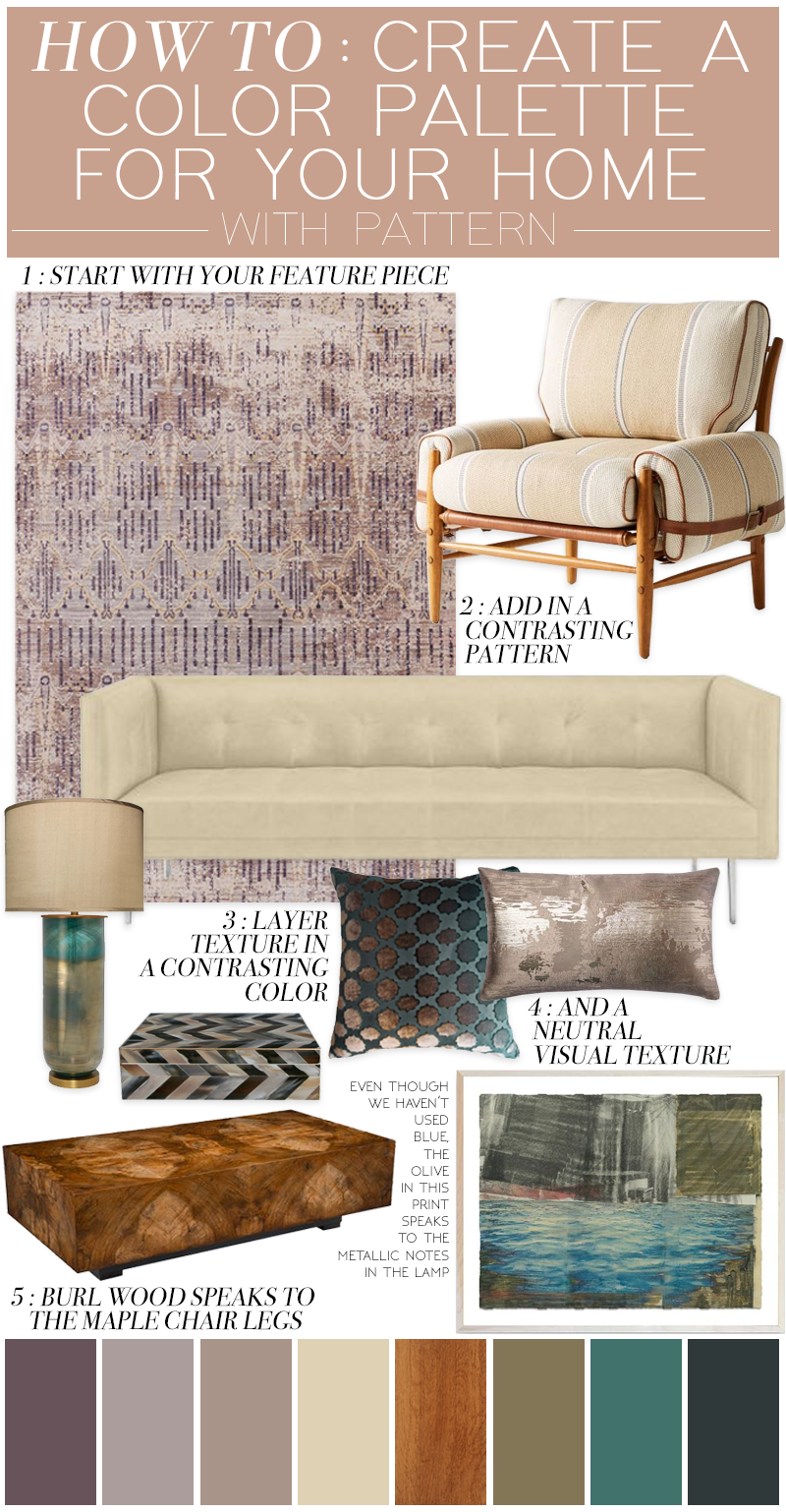
Let's start with an example:

The first rule is that there are no rules. Now that may contradict this entire post, but it's true. The goal is to create a palette you are happy with. No one can tell you any one color doesn't go with another. If you like it, it works. BUT, if you're not sure what you like, this is a way to navigate that.
1 : First, start with your feature piece. It may be a rug, a pillow, a bold piece of art. This is your starting point and where you will draw your inspiration for the remaining colors or finishes. It could be a super busy piece, or one solid color. Whatever it is, start there. This is your first color to build from. In this space, you can incorporate ANYTHING in this color, or any range of that hue - either darker or lighter.
2 : Add a pattern. The chair in my moodboard is neutral, so the color can work most anywhere. I've pulled this neutral beige out of the rug, but the pattern is so different from the lines in the rug, so it pops against it.
3 : Next - find a contrasting color. In this example, I chose a teal to complement the dusty mauve. There's no rhyme or reason to it - I just like how they look together. They're different from each other and stand up nicely next to one another.
When choosing a color, you can pull out a color from your statement piece, or choose any other color you like. If you're having trouble choosing a contrasting color, start with the color wheel! Opposites attract, so you have that bit of extra insurance there. But you could also use a color right next to another on the wheel. You really can't go wrong.

4 : Continue to introduce texture. You now have two main colors to work with, as well as a range of hues from dark to light. By choosing fabrics and pillows and throws in these colors - but items with texture - you're introducing movement to the space as well as creating layers. Layers are KEY in designing a space that is warm and inviting and they keep they eye moving around a room. Remember, texture is not just something that is obvious to the touch. Visual texture is important as well.
5 : If I kept everything in this space teal and mauve, it would be boring. I wanted to introduce another "color" into the space in the form of wood. The burlwood table is perfect for many reasons. First, it coordinates with the maple chair legs. They speak to each other in the room, but don't feel "matchy." The orange/yellowish hue also pops really well against the mauve rug. (On the color wheel, purple is across from yellow, so they are the perfect complement.)
Notice how everything in this moodboard has another item it coordinates with. A big rule of thumb is to let everything in your space have a buddy. You will create harmony and nothing will feel out of place.
My leather sofa speaks to the table lamp, the light fabric in the chair, and the cream tones of the rug. The teal lamp and pillow offer contrast in a complementary color. The gilded gold lamp has beautiful olive tones which are brought out again in the artwork. It's all about creating balance and all your crazy patterns and colors will just work!
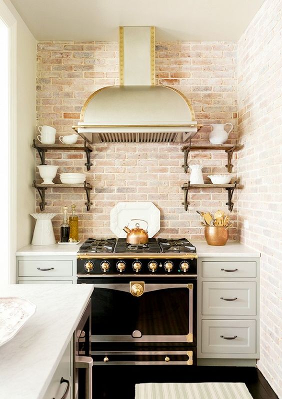
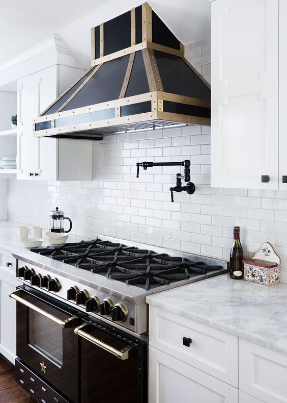
Here are some of my favorite spaces that show seamless color and pattern combinations:

What colors do you love in a home color palette? And send me a message to share you color palette and pattern concerns!